As a digital product grows, it collects inconsistencies: five shades of blue, three styles of button, forms that behave differently on each screen, and developers rebuilding the same dropdown again and again. Each one is small, but together they slow teams down and confuse users. A design system solves this by giving designers and developers a shared set of reusable components, rules and documentation. This guide explains when a design system pays off, how to start small without a large budget, and how to keep design and engineering aligned, with practical advice for product teams and businesses in India.
What a design system is
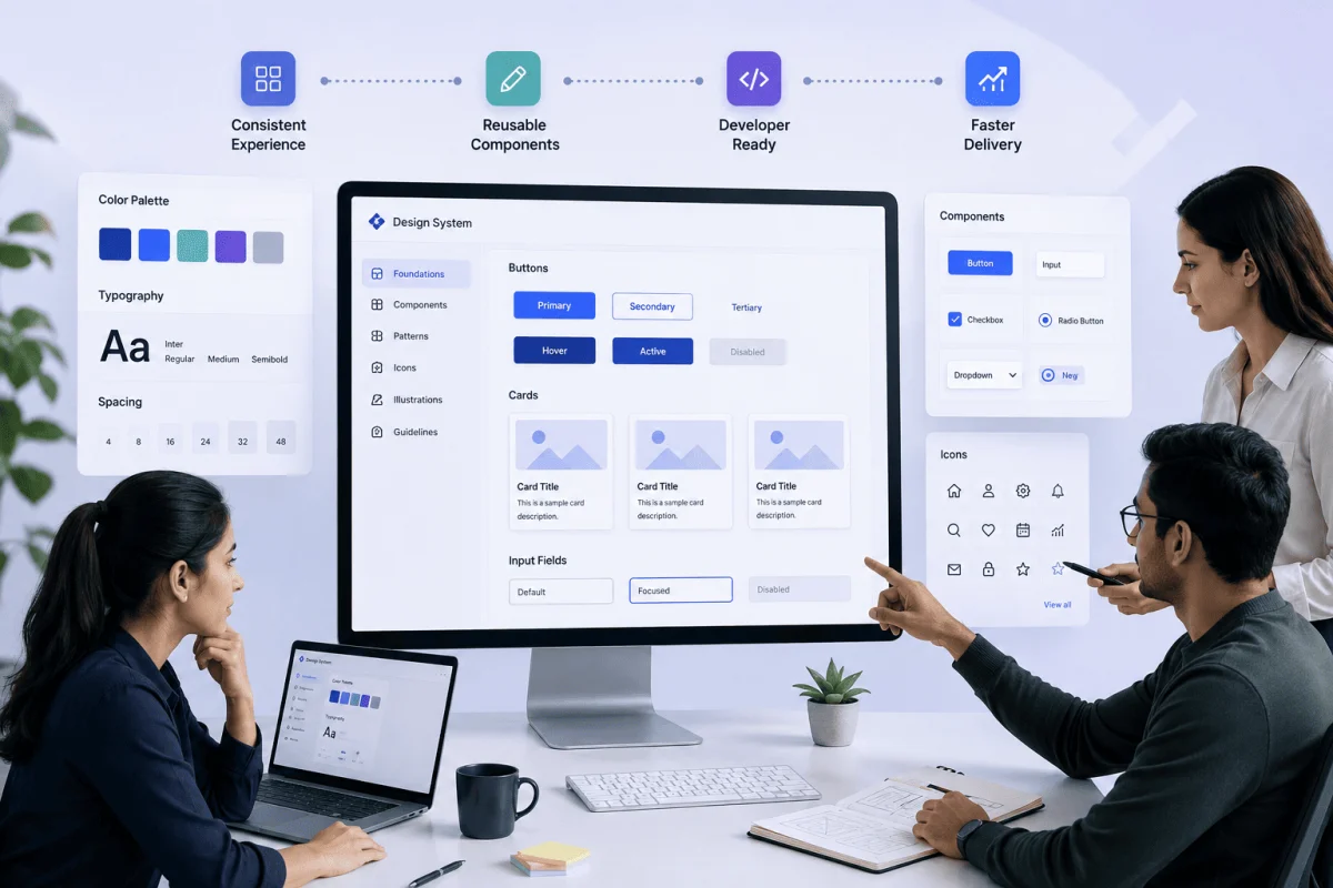
A design system is more than a style guide or a UI kit. It usually has three layers:
- Foundations (design tokens): colours, typography, spacing, shadows, border radius and breakpoints, stored as named values.
- Components: reusable building blocks such as buttons, inputs, cards, modals, tables and navigation, built in both design files and code.
- Guidelines: when and how to use each component, content and tone rules, and accessibility requirements.
The key idea is a single source of truth: the button in the Figma library and the button in the codebase are the same thing, with the same name and behaviour.
When a design system pays off
| Situation | Is a design system worth it? |
|---|---|
| One small marketing website, rarely updated | Usually not; a simple style guide is enough |
| A growing web app with several developers | Yes, start with core components |
| Multiple products sharing a brand (web, mobile, admin) | Yes, high value |
| Frequent new features and screens | Yes, speeds up delivery |
| Agency or in-house team handing work between people | Yes, reduces rework and onboarding time |
Signs you need one now
- Developers ask designers for the same specifications repeatedly.
- QA keeps reporting visual inconsistencies.
- Your web app and mobile app look like they come from different companies.
- New team members take weeks to learn "how things are done".
- Simple UI changes require edits in many places.
Benefits you can expect
- Faster delivery: new screens are assembled from existing components rather than designed and coded from scratch.
- Consistency: users learn patterns once and recognise them everywhere.
- Better accessibility: accessible components mean every screen inherits good contrast, focus states and labels.
- Easier rebranding: change a token and the update flows across the product.
- Smoother handoff: designers and developers speak the same language.
How to start small
You do not need a dedicated design-system team to begin. Most Indian startups and SMEs can start with a focused, practical version.
1. Audit what you already have
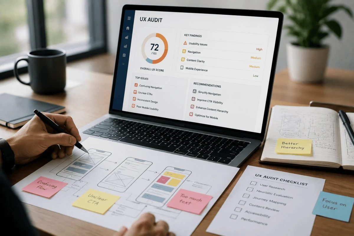
Take screenshots of every button, input, colour and heading style in your product. Group similar ones. This "interface inventory" usually shows how much duplication exists and makes the case for consolidation.
2. Define foundations
Agree on a limited colour palette, a type scale, a spacing scale (for example, multiples of 4 or 8 pixels) and breakpoints. Store them as design tokens in both your design tool and your code, such as CSS variables or a theme file.
3. Build the ten most-used components
Start with buttons, text inputs, selects, checkboxes, cards, alerts, modals, tables, tabs and navigation. Build each one properly once, with states such as hover, focus, disabled, error and loading.
4. Document as you go
For each component, note its purpose, variations, do's and don'ts, and accessibility notes. A simple page in your wiki or a tool like Storybook is enough to start.
5. Use it in real work immediately
Apply the system to the next feature you build. Real use reveals gaps faster than planning sessions.
Keeping design and engineering aligned
- Shared naming: use the same component and token names in Figma and in code.
- One owner: appoint a design lead and a developer lead who approve changes together.
- Contribution process: anyone can propose a new component, but it is reviewed before being added.
- Versioning: release the component library in versions with change notes, so teams can upgrade deliberately.
- Regular reviews: a short monthly review of new patterns and inconsistencies keeps the system healthy.
Tools commonly used
- Figma libraries and variables for design components and tokens.
- Storybook for documenting and testing coded components.
- Component frameworks in React, Vue, Angular or Flutter.
- Token tools that sync design values into code.
- Visual regression testing to catch unintended changes.
Common mistakes to avoid
- Trying to design every possible component before shipping anything.
- Building a beautiful library that developers never adopt.
- Letting design and code drift apart over time.
- Ignoring accessibility until the end.
- Treating the system as a one-time project instead of a living product.
Typical effort
As typical ranges, not quotes: a starter design system with foundations and ten to fifteen core components often takes three to six weeks for a small design and development team, and then grows with the product. Larger systems covering several products take months and need ongoing ownership.
Design systems for enterprise and government software
Design systems are especially valuable for internal and enterprise software such as ERP, HRMS and hospital systems, where staff use dense forms and tables all day. Consistent tables, filters and forms reduce training time and data-entry errors. For government departments and public-sector bodies in Odisha with many users of varying digital comfort, clear and consistent interfaces make adoption easier.
Starter checklist
- Interface inventory completed.
- Colour, typography and spacing tokens defined.
- Ten core components designed and coded with all states.
- Documentation page for each component.
- Owners and contribution process agreed.
- Next feature built using the system.
Before you build a design system for an existing product, a UX audit before redesign helps you know which patterns to keep. Our UI/UX design services include design systems and component libraries, and our web application development team turns them into reusable code. Contact us to discuss your product.
Measuring success
Track how long typical screens take to design and build before and after adoption, the number of visual bugs reported, and how many screens use library components rather than one-off styles.
Frequently Asked Questions
Is a design system only for large companies?
No. Small teams benefit from a lightweight system with foundations and core components, especially when the product is growing or several people work on it.
What is the difference between a style guide and a design system?
A style guide covers visual rules such as colours and fonts. A design system adds reusable coded components, usage guidelines and processes for keeping design and code in sync.
How long does it take to create a design system?
A practical starter version typically takes three to six weeks, then evolves with the product over time.
Do design systems work for mobile apps too?
Yes. The same tokens and principles can be applied to web and mobile, with platform-specific components where needed.

Written by Deepankar Saha
Deepankar Saha has 16+ years of experience in software development and entrepreneurship. He leads Utility Cube Technologies, working with founders and operations teams to plan, build, and grow websites, applications, and business software they can run with confidence.